Archive Fever!

Tags

, , , , , , , , , , , , , , , , , , , , , ,

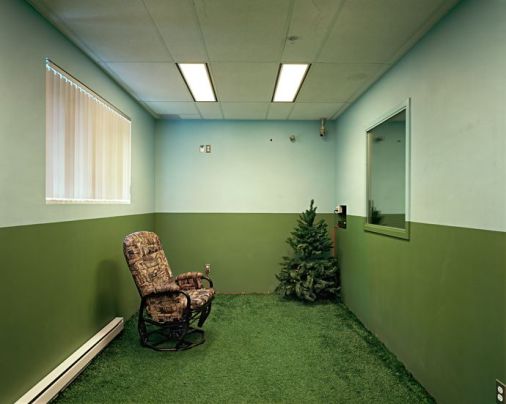
Last week I finally made it to Archive Fever! at the Canadian Clay and Glass Gallery. It’s a rather unconventional exhibition, set up more like an archival library where you sign out boxes filled with things by some of today’s most innovative and creative thinkers. The experience is quite fun, you get to wear archival gloves to take out and examine the contents of the boxes. I could have spend hours looking at all the different boxes, but sadly I only had two. Nonetheless, I got to look at some pretty interesting stuff and it got me thinking about PARADOXES. The short essay below sums up my conclusions about paradoxes with regards to archiving.
Featured image

An Investigation of the Inherent Paradox in Archiving

When we hear the word ‘archive’ we might think of boxes of lifeless records in a dark room. They are, however, much more than that, encompassing almost all aspects of our lives. Dating back to the cave paintings of Neanderthals, humans have always had a strong urge to store information for numerous reasons such as remembering the past, understanding and applying knowledge, and to create a better future. Whether it is probes discovering, measuring, and storing data about distant areas of space, or a teenager writing a blog and taking ‘selfies’, archiving is part of our daily lives. Archive Fever!, an exhibition curated by Krista Blake, embodies this diversity in archiving and creates an ethereal environment by revealing its inherent recursive and paradoxical aspects. Paradoxes are contradictory statements that are based on sound premises, possessing the quality to fascinate by igniting discussion and critical thinking. Archive Fever! subtly presents such paradoxes about the concept of archiving itself. The exhibition is set up as an archival library where visitors are invited to ‘check out’ boxes by contemporary creative thinkers: scientists, writers, artists, and musicians, and discover something new, undoubtedly leaving them with more questions each time.

Hinting at the paradoxical nature of archiving, George Dyson and Crystal Mowry have created boxes whose contents are self-referential. A seemingly empty book from the 19th century titled The Register of Unclaimed Goods inhabits Dyson’s box. However, it contains a single entry on page 101, referring back to itself, creating a perplexing self-referential cycle in which The Register of Unclaimed Goods is registered as an unclaimed good. Moreover, Crystal Mowry’s box containing embossed pages further reinforces the concept of the self-referential. The text reads: “What comes next is better than what came before”, suggesting that next page is better, presenting a paradox as all the pages are exactly the same. We store information party because we want to learn from our experiences and create a better future. However, Mowry’s paradox suggests that while we judge our past harshly and predict a better future, the distinction between the two is small or even non-existent. The pages become archives of the past as we read them, filling us with hopes of a better future that never comes.

The concept of paradoxical archiving is further reinforced by quantum physics principles found in theoretical physicist Lucien Hardy’s box. Within the box there are eight smaller boxes demonstrating complex quantum theories using simple analogies with cats, dogs, and balls. A central idea of quantum theory is that matter exists simultaneously in all of its possible states, but once it is observed, it exists only in its measured form. Hardy illustrates this through the box holding Schrödinger’s Cat, suggesting that until you open the box to see if the cat is dead or alive, the cat is simultaneously dead and alive. This phenomenon called quantum superposition seems impossible, but according to quantum theory this happens at atomic and subatomic levels. It is almost like all the archival boxes in the exhibition exist in their quantum superposition as they encompass all that is possible, possessing a sense of mystery about what they might contain. Choosing an archive is accompanied by anticipation for not one thing but rather the possibilities of anything. It is the act of opening the box and observing the contents that solidifies them.

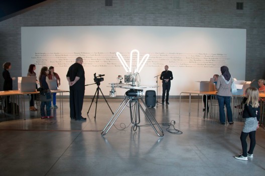
Moreover, the work of Pascal Dufaux further embodies the concept of recursive archiving. Dufaux’s rotating camera in the center of the gallery also toys with the idea of self-referential archiving. The display is delayed by 45 seconds, creating the illusion of a parallel reality shifted in time. It functions as a heterotopia, as defined by Michel Foucault; a slice or accumulation of time both fleeting and permanent, something that exists in our reality but at the same time encompassing another world. The work also speaks to the absurdity of our attempt to document all aspects of life. The camera rotates on two axis, resulting in the recording of itself in a concave mirror while also catching glimpses of the space behind. A phenomenon inherent to archives as they reflect back upon themselves while possessing clues about the past in anticipation for the future.

All in all, George Dyson’s antique registry, Crystal Mowry’s self-referential pages, Lucien Hardy’s quantum theoretical analogies, and Pascal Dufaux’s device shifting the dimension of time all approach the concept of archiving from different angles while also embodying a riveting fundamental truth in archiving: looking to the past and the future simultaneously. Archives are mirrors of the past and the future concurrently coexisting in time and space.

Lynne Cohen – False Clues

Tags

, , , , , , , ,

It’s been quite a while since I’ve posted anything on my blog so I thought I would go all out and post a critical essay I’ve written on Lynne Cohen‘s photographs. She was an award-winning photographer and sadly she has recently passed away. Her work is very interesting and thought-provoking – just read my short essay and you’ll see! 🙂

Featured image

An investigation of the dualities that shield the underlying stories in Lynne Cohen’s photographs

The exhibition titled False Clues at the Kitchener-Waterloo Art Gallery brings together a collection of Lynne Cohen’s works. Consisting of forty large scale photographs dating all the way back to 1971, the works in the exhibition communicate with each other, hinting at Cohen’s overarching interest in investigating the exertion of power through constructed environments, manipulation, concealment, and control. These commentaries, however, are well hidden behind the facade of neutrality, often alienating the viewer by narrowing the window through which the photographs can be accessed. Still, Cohen employs certain formal aspects in the making of the photographs that result in qualities that seduce the viewer, resulting in a formal dance of push and pull. The photographs’ inherent ambiguity and ambivalence further contributes to these dualities, resulting in an overall strange and overwhelming experience of viewing the works.

For works of art the titles’ role is to broaden the interpretation rather than offer explanations. Cohen’s titles function similarly, as their vague descriptions make it impossible to identify a specific place and contribute to the interplay of ambivalence and ambiguity within the photographs. Like most of Cohen’s photographs, Spa (2000) is ambivalent in a sense that it represents a real space that has specific functions; but at the same time these functions are stripped from the space by Cohen’s objectively neutral stance of shooting and the act of transforming it into an image. The scene is both sociologically and aesthetically interesting which further resonates the qualities of ambivalence (Poitven). At the same time however, the photograph is also ambiguous because the viewer will never know exactly what goes on in these spaces other than vague implications about the functions of spas and swimming pools. The uncertainty of the location of the light source further reinforces the ambiguity of the space, oscillating between inducing feelings of claustrophobia and infinite space (Ewig et al.).

Cohen also employs techniques to seemingly make her work appear neutral. This illusion of neutrality functions as a shield to camouflage Cohen’s use of irony and criticism. By taking an objectively neutral stance in terms of photographic choices, she reveals a “scarcely neutral” subject (Ewig et al.). These choices include emphasizing the illusion of neutrality with the use of relatively homogenous and flat lighting, symmetry of composition, and deep focus (Ewig et al.). These elements work together to hide the complex themes Cohen is communicating through the photographs. This apparent neutrality is provoked by the suggestions of people in the photographs. While the absence of people makes the spaces appear more neutral, this absence becomes presence through the traces of human occupation, hinting at implicit stories (Ángeles). The positioning of the furniture, such as in Blackboard, reveals who is in charge while drawing a line between the viewer and the implied authority (Ewig et al.). The chair becomes a person and the eerie human presence lingers with the “hint of an activity just finished” (Ewig et al.). The enigmatic diagrams allude to Cy Twombly’s squiggles and raise questions about what is being taught in the classroom .

The photographs also play a game of push and pull with the viewer; they’re inviting and distancing at the same time. In Spa (1996) the bizarre subject of the photograph distances the viewer while the technical aspects and the size of the images seem to seduce and draw the viewer in. The photograph becomes a “framed window” into a a ostensibly different world that is, in fact, our own (Ángeles). The work (along with all other works in the exhibition) is also hung lower than usual with considerations to the relationship of the body to this ‘window’ in order to provide an easier point of access. Furthermore, Cohen employs elements of Baroque painting to involve the viewer both physically and psychologically (Ewig et al.). At the same time however, the strangeness of the scene expressed through the irregular shape of the room and the tiles, the eerie light under the door, and the wire looped from the neon light works to keep the viewer distanced. The distortions of the view camera, including flattening horizontals and accentuating verticals, further emphasizes this sense of alienation. The viewer cannot help but feel out of place when entering the image, as if the only role to be taken is sitting down on the chair and becoming the object of the ‘experiment’.

All in all, the selection of photographs in the exhibition successfully surveys the career of Lynne Cohen along with her interest in human condition in relation to constructed environments; and even though at first glance the works seem alienating and the stories are hidden behind the ostensible objective neutrality of the spaces, it is precisely Cohen’s intention to indirectly probe, question, and reveal rather than pronounce.

References

Ewig, William A., et al. Camouflage: An Interview with Lynne Cohen. No Man's Land. By Ann 	Thomas. Thames & Hudson, 2001. Print. 

Poitevin, Jean-Louis. "The Irrepresentable." Review. Lynne Cohen. Web. 23 Oct. 2014. 	<http://www.lynne-cohen.com/1024x768/pages/inline_poitevin.htm>. 

Ángeles, Álvaro De los. "Between No-place and No-Man's Land." Review. Lynne Cohen. Web. 23 Oct. 	2014. <http://www.lynne-cohen.com/1024x768/pages/inline_entre.htm>. 

Jenn E Norton – Tesseract

Tags

, , , , , ,

I was browsing the internet when I came across Jenn E Norton’s installation titled Tesseract. I was fascinated by the interactive space and the unique experience created for each individual viewer. Sadly, this is one of those works you have to experience in person, but even watching the documentation is intriguing.

Edward Tufte – Envisioning Information

Tags

, , , ,

Edward Tufte

One of the graduate students lent me Edward Tufte’s book titled Envisioning Information after she heard about my interest in data visualization. And although I have not yet finished reading the book, I was too excited and restless not to make a post about it. It truly is an amazing collection of data art.

The book mentions the absence of a Museum of Cognitive Art which resonates so well with my projects. Displaying information visually is something that hasn’t gotten much notice within the art world. But why shouldn’t it?

I should get back to reading …

Unnumbered Sparks

Tags

, , , , , , , , ,

Unnumbered Sparks is a beautiful interactive sculpture that I really wish I could’ve seen and experienced in person. It is a net-like structure that was hung in the sky between the buildings in Vancouver. But what is most fascinating about the piece is that people could connect to it through their smartphones and draw patterns with the light.

Artists: Janet Echelman,Aaron Koblin

Stefanie Posavec

Tags

, , , , , , , , , , ,

All_3_MemoryPalace_trimtoedge

Stefanie Posavec is a data designer who often works with language, literature, and science. Unlike most designers, she uses a hand-crafted approach and claims she cannot program at all.

The images shown here are from an exhibition for a short story written by Hari Kunzru. The story took place in the future, post-apocalyptic London where knowledge and information were destroyed and nature took over.

To illustrate the story, Posavec created a series of world maps illustrating this transition. The first map titled Accounting was constructed by mapping altitudes of capitol cities and the distances between them. This map meant to represent how people in the story mapped, measured, and gathered data on every aspect of life. The next illustration, Withering, depicts the electric storm that destroyed all the data as the numbers crumble into dust. Wilding, the last map, shows weeds growing from the ruins and triumphing over data and information.

eCLOUD

Tags

, , , , , , , , , , ,

eCLOUD is a permanent installation at the San Jose International Airport. It was inspired by the volume and behavior of an idealized cloud. It is a dynamic sculpture made from polycarbonate tiles that fade between transparent and opaque states. The patterns formed by these tiles transform according to real time weather from cities all around the world, also shown on the digital display next to the cloud.

Artists: Aaron Koblin, Nik Hafermas, Dan Goods

Submap: Data Visualization

Tags

, , , , , , , , , , , ,

SubMap is a project by a group of Hungarian artists: Dániel Feles, Krisztián Gergely, Attila Bujdosó, Gáspár Hajdu and László Kiss. In their work they often visualize some sort of data, that fascinates them, on maps.

This particular project titled Ebullition compiles data from one of the largest Hungarian news sites (http://www.origo.hu/index.html) and presents it in a 30 fps animation. Whenever a village or a city is mentioned in the news, that instance is translated into a dynamic force on the drawn map. Each frame is a single day and every second visualizes a full month. The analyzed data dates back all the way to 1998 and up until 2010.


Artist’s Statement

Tags

, , , , , , , , , , , , , ,

IMG_6015

My work is fuelled by my need to explore my cultural identity as a Hungarian immigrant living in Canada. Employing various processes across diverse media, my work as a collective functions as a cumulative self-portrait. My Thoughts Exactly was inspired by the strange experience of dreaming in English for the very first time. I consider that night, when the English language entered my unconscious mind, the marker for becoming bilingual.

Linguists acknowledge that language influences thinking. This principle of linguistic relativity suggests that we cannot think without language. Can we then think of ideas our language does not name? And if thought is a consequence of language, people living in a new place must think differently from the rest of the population. But sooner or later immigrants acquire the common tongue of their new home and gradually lose their native language. So how does this shift in language alter the way they think? Such cognitive processes of the mind remain mysterious today. My Thoughts Exactly takes on the challenge of documenting the duration of thought in different languages through the use of a computer program that measures the reaction time to certain images. The paintings are representations of this data. And, as such, they function as portraits. Language becomes portraiture, reflecting upon its unique and vital role in our lives.

Jen Lowe – One Human Heartbeat

Tags

, , , , , , , , ,

onehumanheartbeat

I came across Jew Lowe’s intriguing work the other day as I was browsing the internet looking for artists who deal with representing data visually in their works. It looked interesting at first glance and when I read what it was about I found it even more fascinating.

Lowe wears a watch that records her heartbeat and then uses a program that visualizes the data. The mechanical heartbeat is always a full day behind, as kind of an afterlife beating away on the screen. The display also includes other information such as the number of Lowe’s remaining days according to statistical calculations. The sense of calmness ruminating from the beating heart is paralleled by the urgency of the countdown of her life.

Animation: Jew Lowe – One Human Heartbeat